London Tube Map Lines Guide City Journeys
- 1.
What Even Is the London Tube Map, Y’all?
- 2.
The Full Roster: Meet All 11 London Tube Map Lines
- 3.
Why the Colors Matter More Than Your Ex’s Mood Swings
- 4.
Harry Beck: The OG Who Made Chaos Look Clean
- 5.
Can You Actually Download This Magical Scroll?
- 6.
Decoding the Symbols: It’s Not Just Pretty Colors
- 7.
Fun Stats That’ll Make You Sound Smart at the Pub
- 8.
Common Pitfalls That’ll Make You Look Like a Tourist (Oops)
- 9.
How the Map’s Changed Since Your Grandad’s Day
- 10.
Your Next Steps: Dive Deeper Into the Rabbit Hole
Table of Contents
london tube map lines
What Even Is the London Tube Map, Y’all?
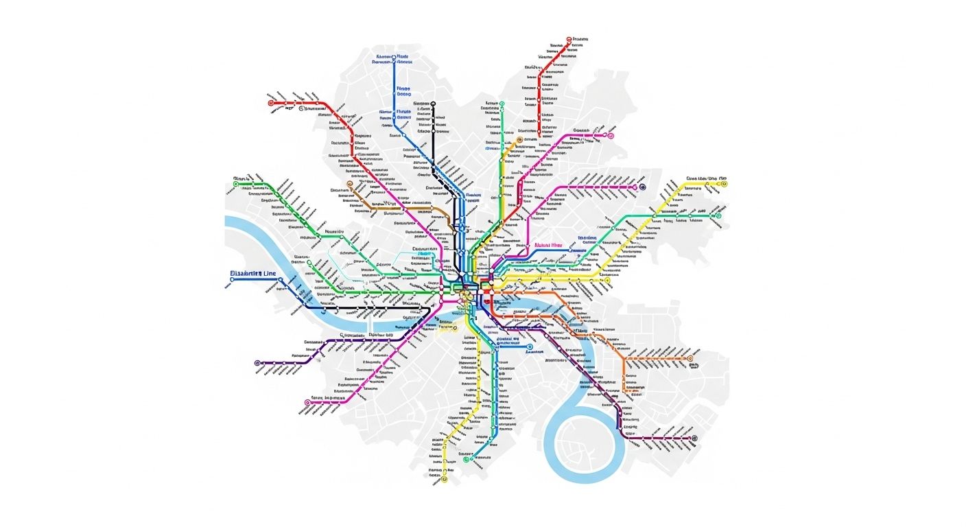
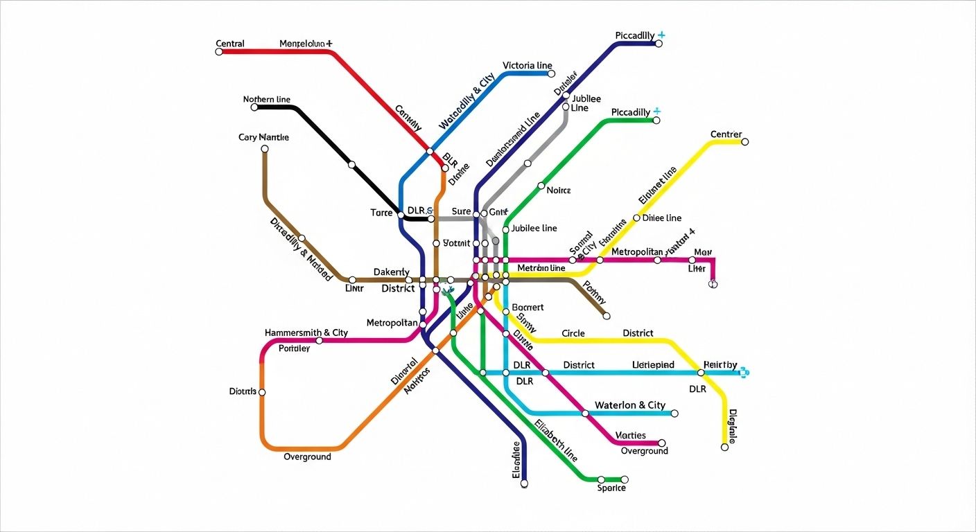
Ever felt like you’re lost in a maze of spaghetti that’s been tossed by a very confused Italian grandma? That’s basically what staring at the london tube map lines feels like for first-timers. But hey, don’t sweat it—this ain’t just some random scribble on a napkin. It’s a legit design icon, a masterpiece of urban navigation that’s as British as queuing politely or complaining about the rain. The london tube map lines aren’t drawn to scale or geography; nah, they’re all about clarity and connection. It’s a diagrammatic map, baby! Meaning it shows you how to get from A to B without making your brain do parkour. The whole thing was dreamed up by this genius bloke named Harry Beck back in 1931, and honestly, it’s held up pretty darn well [[11]]. So next time you’re squinting at those colorful squiggles, remember: you’re holding a piece of history in your sweaty, slightly-lost palms.
The Full Roster: Meet All 11 London Tube Map Lines
Alright, gather ‘round, folks! Let’s roll call for the squad that makes London move. There are exactly eleven london tube map lines, each with its own name, color, and personality quirks. You got your Bakerloo (that’s brown), Central (fire-engine red), Circle (sunshine yellow), District (that green that screams “I’m eco-friendly, mate”), Hammersmith & City (a soft pink that’s surprisingly tough), Jubilee (cool grey, like a Bond villain’s suit), Metropolitan (a deep purple that’s seen some things), Northern (black, because it goes deep, y’know?), Piccadilly (that blue that matches your pre-flight anxiety), Victoria (light blue, crisp and efficient), and the little but mighty Waterloo & City line (teal, and it only does two stops, bless its heart) [[10]]. Memorizing these london tube map lines is basically your initiation into the London commuter club. Welcome aboard!
Why the Colors Matter More Than Your Ex’s Mood Swings
Don’t go thinking those colors on the london tube map lines are just there to look pretty (though they do). Oh no, they’re your lifeline. Transport for London (TfL) has got official Pantone codes and everything—like, the Bakerloo line *has* to be PMS 470, or the universe might implode [[1]]. This strict color-coding means even if you can’t read the tiny station names, you can follow the london tube map lines by hue alone. It’s visual shorthand for “don’t get off here, dummy.” Lost in the labyrinth of King’s Cross? Just find the red Central line snake and follow it. The colors on the london tube map lines are the unsung heroes of your daily commute, silently guiding you away from accidental trips to Croydon.
Harry Beck: The OG Who Made Chaos Look Clean
Before Harry Beck, the london tube map lines were a geographic nightmare—a tangled mess that looked more like a nervous breakdown than a transit guide. Enter Beck, an electrical draughtsman who thought, “What if we ditch realism and just show the connections?” Genius. His 1931 schematic map used only vertical, horizontal, and 45-degree lines, with stations spaced evenly for readability over accuracy [[12]]. The public went nuts for it. TfL was skeptical at first, but they printed a trial run of 500 copies in 1933, and boom—icon status [[14]]. Today, every subway map on the planet owes a debt to Beck’s vision for the london tube map lines. He didn’t just draw a map; he gave London its nervous system.
Can You Actually Download This Magical Scroll?
Abso-freakin’-lutely, you can! TfL, those lovely folks who keep the trains (mostly) running, offer free PDF downloads of the official london tube map lines right on their website [[21]]. Whether you need the standard version, a large-print edition for your nan, or even a step-free guide if you’re rolling wheels, it’s all there [[28]]. Just head to tfl.gov.uk/maps, click the red link, and boom—your pocket-sized navigator is ready. No shady third-party sites needed; this is the real deal. Having the london tube map lines saved on your phone is like carrying a cheat code for the city. Seriously, do it before your next adventure—your future self will thank you when you’re not crying in a random Zone 4 station.
Decoding the Symbols: It’s Not Just Pretty Colors
Okay, so you’ve got the london tube map lines colors down, but what’s with all those little icons? Don’t panic. Those symbols are your secret decoder ring. A black circle with a white cross? That’s an interchange station where you can hop between multiple london tube map lines. A wheelchair symbol? Step-free access, hallelujah. A tiny train icon? That’s a National Rail connection, your ticket outta London if you fancy a countryside escape. And those little tick marks along the lines? They show you roughly how many stops are between stations. Mastering these symbols turns the london tube map lines from a confusing art piece into a practical tool. It’s like learning the language of the city itself—one pictogram at a time.
Fun Stats That’ll Make You Sound Smart at the Pub
Let’s drop some knowledge bombs about the london tube map lines. The entire network spans over 250 miles of track—that’s like walking from London to Paris, but underground and with way more strangers awkwardly avoiding eye contact [[10]]. The Northern line is the longest of the london tube map lines at a whopping 58 kilometers, while the Waterloo & City line is the shortest, clocking in at just 2.5 kilometers (it’s basically a glorified corridor). Oh, and fun fact: the Circle line isn’t actually a perfect circle anymore; it got stretched into a spiral in 2009 because, well, London’s weird like that. These stats aren’t just trivia—they’re proof of the sheer scale and quirkiness of the london tube map lines ecosystem.
| Line | Color | Length (km) | Stations |
|---|---|---|---|
| Central | Red | 74 | 49 |
| Northern | Black | 58 | 52 |
| Waterloo & City | Teal | 2.5 | 2 |
Common Pitfalls That’ll Make You Look Like a Tourist (Oops)
We’ve all been there—standing on the platform, sweating bullets, wondering if you’re on the right branch of the london tube map lines. One classic rookie mistake? Not checking the final destination on the train. The Central line, for example, splits like a bad relationship—it goes to Epping *or* Hainault via Woodford. Get that wrong, and you’re in for a loooong ride. Another blunder? Assuming the map’s geography is real. That short hop from Covent Garden to Leicester Square on the london tube map lines? It’s literally a 2-minute walk above ground. Taking the Tube for that is like using a helicopter to cross the street. And please, for the love of all that’s holy, don’t block the left side of the escalator. We’re not animals.
How the Map’s Changed Since Your Grandad’s Day
The london tube map lines you see today ain’t your grandad’s map. While Harry Beck’s core design remains sacred, TfL’s been tinkering for decades. They’ve added new lines like the Jubilee extension in the ‘90s, tweaked the Circle line into its current lopsided loop, and even integrated other services like the Overground (orange) and the Elizabeth line (purple) onto newer versions [[15]]. The goal? Keep the map useful as London grows. But purists argue it’s getting cluttered. Still, the essence of the london tube map lines—clarity over cartography—holds strong. It’s a living document, evolving with the city it serves, one colorful line at a time.
Your Next Steps: Dive Deeper Into the Rabbit Hole
Feeling confident about the london tube map lines? Awesome! Now go explore. Start by bookmarking the official map on the Subway Life homepage for quick reference. If you’re a map nerd like us, browse the full collection of transit guides in our Maps category. And if you’re curious how other cities tackle their underground chaos, check out our deep dive on the E Subway Line Map Connects NYC With Ease. The world of urban transit is vast, and the london tube map lines are just the beginning. Go forth and navigate like a local!
Frequently Asked Questions
What are the 11 lines of the London Underground?
The eleven london tube map lines are: Bakerloo (brown), Central (red), Circle (yellow), District (green), Hammersmith & City (pink), Jubilee (grey), Metropolitan (purple), Northern (black), Piccadilly (dark blue), Victoria (light blue), and Waterloo & City (teal). Each line is a vital artery in London's transport network, easily identifiable by its unique color on the map.
What are the London Tube lines?
The term "London Tube lines" refers to the eleven distinct routes that make up the London Underground system. These london tube map lines are color-coded and named, forming the iconic diagrammatic map that helps millions navigate the city daily. They are the backbone of London's public transportation, connecting central boroughs to far-flung suburbs.
Can I download a tube map?
Yes, you absolutely can download the official tube map featuring all london tube map lines! Transport for London (TfL) provides free PDF versions on their website, including standard, large-print, and step-free access guides. Just visit tfl.gov.uk/maps to grab your copy and have the ultimate navigation tool at your fingertips.
What is the London Tube map?
The London Tube map is a schematic diagram of the London Underground network, showcasing all eleven london tube map lines with their respective colors and station interchanges. Designed by Harry Beck in 1931, it prioritizes topological clarity over geographical accuracy, making it an intuitive and globally influential tool for urban navigation.
References
- https://tfl.gov.uk/cdn/static/cms/documents/tfl-colour-standard.pdf
- https://en.wikipedia.org/wiki/Tube_map
- https://www.ltmuseum.co.uk/collections/stories/design/mapping-london-iconic-tube-map
- https://content.tfl.gov.uk/standard-tube-map.pdf
- https://en.wikipedia.org/wiki/List_of_London_Underground_stations